Thursday, 6 November 2014

Logos and Brand Identity

Brand identity is how a business or a brand wants there company to be precised, usually through their brand  name, logo, imagery and  through other ways of communication.


Rules for logo design 

- The logo should reflect the company, a trait of the company or theme that the company is about.
- Avoid too much detail, a simpler logo is much more eye catching and recognisable that a more complex one but avoid been too simplistic as it can have the opposite effect.
- Colour, avoid using colours that are to bright as they can be harsh on the eyes, it is best to use colours that are close to each other. tip: if the logo doesn't work well in black and white it wont work in any colour.
- Make sure the logo is balance, make sure the eye isn't drawn to one area.  


Tuesday, 4 November 2014

Body Casts

As we had been told that we were going to create a mural for the construction department and had previously done some face casts we then did some experimentation with doing some body casting. I think that the cast are good to say it was the first time that we did it. The cast were pretty simple to do as what we had to do was to cover one side of the body with scrim and plaster to get the shape of the body but making sure that the cast can be removed. Even though the casts are quite simple they are still quite effective.


Thursday, 16 October 2014

Composition in painting

The rule of thirds is a guideline followed by some visual artists. The objective is to stop the subject and areas of interest from bisecting the image, by placing them near one of the lines that would divide the image into three equal columns and rows, ideally near the intersection of those lines.


The rule of odds means that having an odd number of a subject in a composition means that our brains can not pair the subjects together so easily or create a link between them so easily meaning your eye moves around the painting more.
Leading lines when someone looks at a composition their eyes naturally follow lines within it. so the position and placement of the lines should be considered carefully.
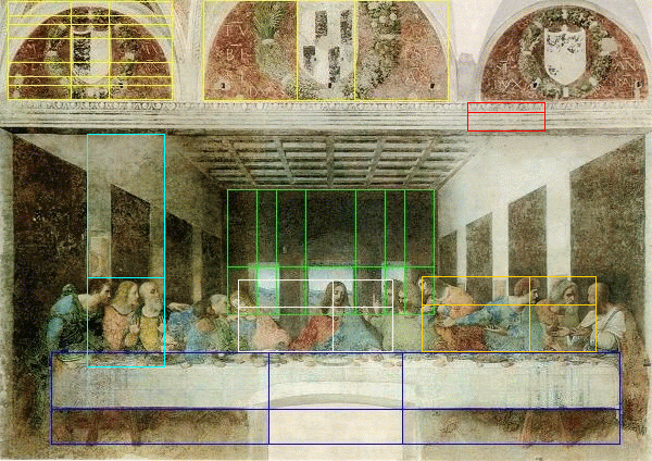
The golden ratio is an actual numeric value which is 1:1.618... which when draw looks like


The golden ratio is found in nature and therefor makes for one of the most balanced and aesthetically pleasing way of creating a composition.


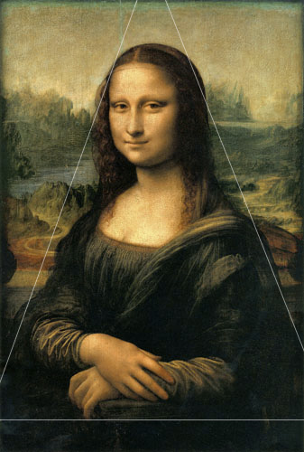
The Golden triangle 


The L shape is where the subject matter is place in an L shape across the piece. 


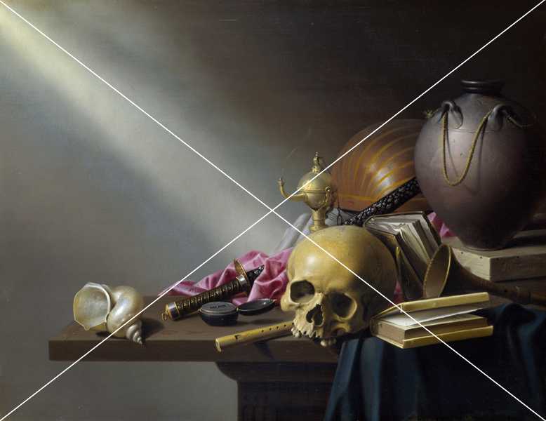
Diagonal composition


Wednesday, 15 October 2014

Day in a box

As an exercise we were told to each sit in our box excluded from the rest of the group the reason for us to sit in the box was to remove all outside influences. Once in the box were told to draw all the shadow we saw and the light that fell in to the box.
 
 
After we drew the light coming in to the box we the were allowed to customise our box in any way  that we wanted to. I did It by making holes in the sides of the box so that when you were on the inside of the box it looked like stars I think that this look quite effective but I could have been a bit more adventurous with how I customised the box. 


String - Negative and Positive Space


As a group we did an session where we used string to break up the room, the purpose of the session was to learn about positive and negative space and how it changes the room. It was really interesting on how the string changed the room as even though we used very little material, as the string made you have to move around the room very differently to avoid getting tangled in the string.
 
After we had covered the room with the string we the covered the place where the string made shapes with tissue paper.