Friday 28 November 2014

Construction Visit

As we are making some sculptures for the construction department we went down to the site to have a look at the space on the wall that we had to work so it will give us a better idea of what we can create when designing them and what will fit in the space.

There are two space that we have to work with the first is the space above the boards and the cross section beams.


The second space is the blank space above at the top of the wall.


Thursday 27 November 2014

Life Drawing 21/11/14

This is the work that i created during our third life drawing session, during the session we where using colour instead of just using black and white to show the tones of the light falling on the figure.


I don't think that i have used to many different colours all in on place and they don't work well together,


For the second study that i did i tried to tone down the amount of colour that i was using, i think that doing this worked a bit better as it docent look as much of a mess than the previous one. I think that the legs have worked best as i have used only one colour over a large area i also think that it works as i have used contouring on the legs so they look a bit more realistic.


I think that the last study that i did works best as again i have tried to use connoting and have used the colour over lager areas. The reason that i doesn't work that well is because of the proportions and angles of the figure as i have got a lot of the proportions wrong.

Body Casts 2

We continued to create body cast to create sculptures for the construction department again, we decided to have to or three people being cast then have everyone else casting them. As we had previously just been told that we had a folk art brief we decided to do some of the cast as if they were from a carnival/circus theme. 


I think that the cast which we tried to create as a circus/freak show look better than the rest as they make for a lot more interesting sculptures than just having casts of people.


London Visit

Tate Modern


V&A - Costume


Wednesday 26 November 2014

Elgin Marbles

Because we are creating the sculpture for the construction department I look at the Elgin Marbles as we intend to create the sculptures in a similar way to how the Elgin Marbles look.


Elgin marbles is a collection of ancient Greece sculptures and architectural details, these are also known as Parthenon sculptures. These sculptures were originally on the Parthenon temple in Greece but were later removed from the temple and shipped to England by the arrangement of Thomas Bruce (7th Lord Elgin), who was the British ambassador to the Ottoman Empire. The removal of the sculptures caused a huge controversy that exemplified questions about the ownership of the cultural artefacts and the return of the antiques to their places of origin and still to this day the controversy is still happening. I believe that the Elgin marbles should be back in Greece, they are part of that country's history, all the sculptures should be together in their rightful place. Imagine parts of Big Ben being in a museum miles away from it's origin. But also Elgin loved the sculptures and wanted to keep them safe so I also don't see the harm with them staying in England. 
 

Sunday 23 November 2014

Final Logo Placement

After i created the final logo i then tried out how the logo would look on different products.


Final Logo

After choosing my final logo i had adapt it so that it would work as a vinyl on a window. Which got me to this as my final logo, i think that the logo works quite well as it bold and eye-catching, the graphic part of the logo could be quite versatile. I feel that the weakest part of the logo is the colour as i am not sure that the colours work that well together.  


Hub Logo Experiments

After choosing my final logo i decided to play about with both the graphic and text to see if i could get the logo to work better.


Thursday 20 November 2014

Life Drawing 14/11/14

These are the life drawing studies from our second week of life drawing, the first were just simple studies done of the life model. I don't think that these studies worked that well as i haven't got the proportion of the body that well mainly the leg and arms as i haven't got the with properly.


The second study was a slightly longer study using contour lines to make the body look as if it is a more natural three dimensional shape. I don't think that i did well at doing the contour lines as they look a little sketchy and the figure still looks flat, i do think that the contour lines have worked best on the top half of the leg as it has made the leg look more three dimensional. I do feel like on this study i have done better at getting the proportion right mainly on the top half of the figure as i don't think i have got the with of the body and have got the legs wrong.


To create this drawing instead of drawing the outline of the model first i got the tone of the figure and built up the drawing that way. I think that the top half of the piece works ok, but towards the bottom the proportion is all wrong. The biggest problem with the drawing is that i haven't got that meany different shades so it makes the figure look flat. 


I use the same technique to record this study, i think that this one has work a little better as i have used contour lines to help show the shape but is still has the same problem as not using enough different shades.


(below) This is a study that someone else (James) in our group has created using the same technique. I like how the piece was create as most of the model has been capture and also lighter lines have been used where there is less light falling.


I used scribbles to draw this study but i don't think that it works at all as i have gone over the top with it and haven't captured the for or tone of the figure very well at all.


This is a drawing that someone else (Amy) in a similar why to the previous drawing that i did. But instead it has been done in a more controlled way which show as the form and proportions of the figure has been capture a lot better that i managed to.


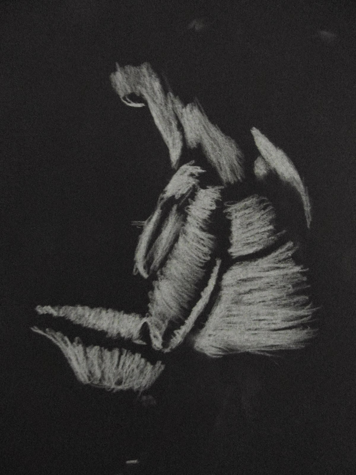
Again this is another piece that someone else (James) created in a similar way. I really liked the way this one has been done as it has been done more loosely with the scribbles but still kept it really controlled meaning that the form and proportion of the model has been captured really well. I also liked how there are different tones captured well but still only using chalk.


I created this study using paint and charcoal, i like the effect that using these materials has created. But i don't think that as a lifted drawing this piece has worked as i have got all the proportions of the figure wrong and the figure looks really flat.


This one i created using the same materials but i feel that this one has worked a lot better as i have used the materials in a more controlled manner meaning that i was able to capture the models proportions more accurately. I still think that i could have controlled it a bit more as the shape of the shoulders i have got wrong and i also could have used some contouring to make the figure look more natural and less flat.


Tuesday 18 November 2014

Folk Art

The basic meaning of folk art is art of the people as it is unlike other arts as it is more accessible. This is because of the basic skills and materials that are use in the making of folk art. Folk art is more about the decorative aspect of art rather that be for aesthetic or political purposes it also doesn't focus on proportion and prospective that is associated with traditional arts. Folk art is not affect by any movements that effect fine art/ high art, nor most of the time any folk art is not made by any professional artist.