Wednesday 30 April 2014

Light


Light (visible light) is a form of electromagnetic radiation that can be seen by the human eye. Visible light has a wavelength of between 400 and 700 nanometres and I is between ultra violet and infra red on the electromagnetic spectrum. 

light can also affect you mood as well as colour it can help create excitement, help bring a sense of calm or peace and create a sense of mystery. A dull cloudy day or rainy day will make you feel sulky and lazy where as a sunny day will give you more energy and make you feel happier and more positive.


Light has the same effect when it is used in doors a lack of light both natural or artificial will make a room fell dull creating a feeling of anxiety and/or depression. But a bright light can also create a feeling of anxiety as it will reflect of surfaces and make people feel edgy.

Tuesday 29 April 2014

Colour Enviroments

 As i want to focus my project on installation and then decided to introduce colour into a darkened room by projecting a colour on to a white board and letting the colour fill the room. i wanted to do this to see if the atmosphere of the room could be changed by introducing a colour to the room. I when doing i took these photo to record what i had created using a long exposure on the camera to capture the light.   


Colour Experiments

As i had researched in to colour psychology i that started doing some experiments with colours and ways to arrange colours.

I first started using hot and cold colours to try and create a feeling of heat or coolness. I started creating them in paint putting a small amount of different warm colours, red ,orange and yellow then spreading them across the papers so they blend together, then doing the same for cold colours.  


I then carried on playing with hot and cold colour but this time i used PVA glue and mixed in different amounts of ink to create the colour, the carefully  poured the colour over the paper and let them naturally blend together.   


Then i tried experimenting with experimenting with complimentary colours focusing on purple and yellow to try and get a striking and eye-catching effect, i used paint, glue and ink and ink on its own to create these pieces.  


Friday 25 April 2014

More colour Psychology

RED

The color Red is the most vibrant of all the colors. It stimulates the adrenal gland and the neurons, which is located above the kidney and controls the release of hormones. too much exposure to the color red can cause stress; it may also cause frustration and provoke anger and it stimulates heartbeat and breathing.

Yellow 

Yellow helps to release a chemical in the brain called Serotonin, essential for causing a happy mood. Yellow helps to enhances concentration and gives the brain and nervous system a "wake up call". But too much yellow can cause fatigue and might make people lose there temper more often as it is the most difficult colour on the eye.

Blue 

Blue. It is believed to have a soothing effect on human mind as it helps to produce some calming chemicals in the brain. But being exposed to to much blue can cause depression, the colour blue can also make objects seem not as heavy and as blue is not a food colour can make people loose their appetite.

Green

Green is the most soothing colour on the eyes and therefor helps relax and helps relieve stress. People also tend to spend more time in a room that is green and it gives of a heeling and hygienic feel.

Pink 

Pink is the most tranquil colour and is known to reduce anger and anxiety and helps keep people calm. 

Thursday 24 April 2014

Colour Psychology


Colour psychology is the study of how human behaviour can be determined by colour, and looks into how colour effects mood and are perceived by people. Although the way a person experiences colour can be effected by their personal and cultural associations.

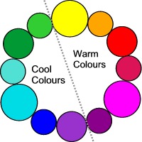
Colour can be seen as warm or cool because of universal factors for example...

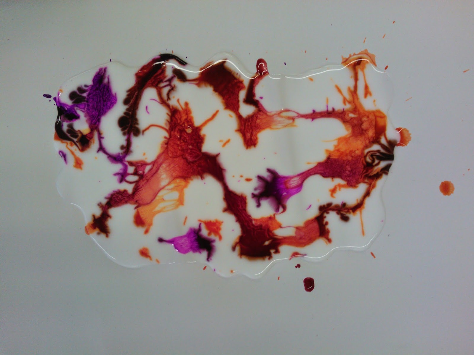
- yellow, orange, and red are seen as warm colour because of the sun and fire.
- blue green and violet are seen as cool colours because of leaves the sky and the sea.


Although weather a colour is perceived as cool or warm can be effected by the brilliance or the lightness or darkness of the colour which changes the colours psychological effect.

A physiological change can occur in a person when they are exposed to certain colours, they can stimulate, excite, depress, tranquilize, increase appetite and create a feeling of warmth and coolness. 

Red - courage, strength, warmth, energy, stimulation, masculinity, defiance, aggression, strain.

Blue - intelligence,communication, trust, efficiency, serenity, duty, coolness, reflection, calm, aloofness, lack              of emotions, unfriendly. 

Yellow - optimism, confidence, extravagance, emotional strength, friendliness, creativity, irrationality, fear,                    anxiety.

Green -  harmony, balance, refreshment, rest, reassurance, peace, boredom, stagnation, blandness.

Violet -  spiritual awareness, luxury, truth, quality, decadence, suppression, inferiority.

Orange - comfort, warmth, security, abundance, fun, deprivation, frustration.

Pink - tranquility, nature, warmth, femininity, love, sexuality, inhibition, emotional claustrophobia, weakness.

Grey - neutrality, dampness, depression, lack of energy.

Black - sophistication, glamour, safety, coldness, menace.

White - hygiene, clarity, purity, simplicity, coldness, sterility, unfriendliness.

Brown - warmth, nature, earthiness, support, lack of sophistication.

Colours can also effect the body for example red can stimulate the senses and raise the blood pressure whilst blue has the opposite effect.


Final Major Project

For my FMP I want to carry on working in my chosen field which is fine art. I am going to continue working in a way similar to how I was working in the Alice in wonderland project, where I was working with installation based on Alice's emotions. I want to continue working on the idea of emotions and using installation to create or provoke an emotion from the viewer. I want to use installation as I feel that the experience that the viewer of the installation is much more powerful and immersive, therefore would be a much effective way to provoke an emotion. Another reason for using installation is that I find it interacting the way a space can be changed or manipulated to get specific feeling to the space which can change a persons emotion, and I want to explore different factors that can be effect the feel of a space. As I am going to continue working with emotions I am going to research the way a space is effected by colour, light and size, I will also need to research other artist who both use installation and/or use artist that use colour or light in their work in a similar way that I want to use them.

Wednesday 23 April 2014

Ernesto Neto


Ernesto Neto is a Brazilian artist, he large creates installations that fill and exhibition space. He often uses soft textures that are often made out of stretchy materials filled with Styrofoam pellets and sometimes aromatic spices. Viewers of these installations are then able to interact with these installations as they are allowed to roam around and touch the sculptures. 


 I decided to look at Ernesto Neto as i like the way he incorporates soft materials and textures in his work and creates a space that viewers can move around. This is something like what i want to create in my work as i want to create a feeling of exploration and excitement.

Material experiments

After creating the environments with the fabric i wanted to experiment with the type of material that i could possibility use and  how that might effect the feel of the environment.


.

Exploring and Confusion

After looking at confusion and the looking at the artist Mike Nelson i then decide to create my own environments that could be explored. I wanted to do this so that people entering the environment would feel a sense of amazement and a little confused as if they were discover something new for the first time, this is because this is the way i thought that Alice would feel when first setting eyes on wonderland. To create the installations i decided to use fabric as it is moves easily and is easy to manipulate.


To create it i use three different pieces of white fabric the first one i did i hung the fabric length ways in a zigzag patterns so you either had to walk around the fabric or move it out the way to get from one side of the room to the other. I think that this worked okay but the fact that you could see the rest of the room detracted from the experience also i think that the simple layout of it meant that you didn't really get lost or confused by where you were so it didn't give the effect that i had hoped for.


I then created another but this time i hung the fabric in the opposite direction so it wasn't as long but went much further around the room. For this one i used two of the sheets and hung them about two feet apart and went to on end of the room and then did a tight curve the coming back again with the fabric getting closer at the curve. This worked a lot better than the previous the layout wasn't more complex but  i think that the way the fabrics ran next to each other made your field of view much smaller and the way the fabric was close to you made it a lot harder to move around the space. 


I then used the layout again but turned the lights on which i thought changed the experience again as the light shone through the fabric with out you been able to see through it and changed the atmosphere of the place making it feel even more like exploring.